At my most recent course on operating models, I had an ahah moment about Process Owner Grids. It is better to lay out the grid with the process steps of the value chain along the top and the organization roles down the side – rather than the other way around.
In my recent blog on Process Owner Grids, I showed a number of examples with the organization roles along the top and the process steps down the side. As I understand it, this is the traditional way of doing a Process Owner Grid. It follows the format of the Decision Grid. The rationale for this format is that it is typically easier to define an organization role in one word (Finance) or a couple of letters (HR or CEO) than it is to find a short definition of a decision. Hence, given the space constraints at the top of a column compared to those at the beginning of a row, it is best to describe the decision in a few words on the horizontal (i.e. at the beginning of a row) and define the organizational roles on the vertical (i.e. at the top of a column). So a decision might be “define the monthly sales target” and those involved might be “Head of Sales”, “Sales Managers”, “CFO” and “CMO”.
The ahah message was that the steps in a value chain are typically laid out horizontally in sequence. Moreover they are laid out like this in the Operating Model Canvas. So, when thinking about the value chain the mind is naturally thinking left to right rather than top to bottom. So it is most natural to put the steps of the value chain at the head of columns in the Process owner grid. Typically the steps are one word, such as “buy”, “design”, “make”, etc; so they fit comfortably at the top of the columns. The organization roles must then go down the side of the table.
The ahah moment occurred because we had drawn up a Process Owner Grid for an example in the traditional way. Then one of the participants, who was only paying partial attention, asked for it to be explained. To aid the explanation, another participant turned the Grid on its side to show his colleague that the rows down the side of the grid were the same as the steps in the value chain. This caused everyone involved to question whether it would not be better to redraw the Grid the other way around.
So, from now on, I think I will draw it with the value chain steps along the top. This has the added benefit of being the same way round as the High-level IT Blueprint. So the Process Owner Grid and the High Level IT Blueprint are similar charts/grids.
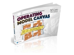
I am ashamed to say that my colleague and co-author Mikel Gutierrez had lobbied to have the Process Owner Grid presented with the value chain along the top in our book Operating Model Canvas – and I resisted because I wanted it to be like the Decision Grid. But I was wrong! Much better for it to be like the High-Level IT Blueprint.


Being that most of your Op model canvas is based on expanding from value chains to inform othe things I would agree that VC at the top running left to right makes good sense. It helps carry one concept on to the next and so on.
Being that most of your Op model canvas is based on expanding from value chains to inform other things I would agree that VC at the top running left to right makes good sense. It helps carry one concept on to the next and so on.
Yes David. Good point.
Andrew – glad you found the compass on this. I have almost always used it this way. In fact one of the most powerful diagnostic processes I know is to lay out the process flow horizontally, then list key performance criteria vertically. Once done you can then identify through user engagement or diagnostics, which part of the process costs most, has poorest quality, least satisfies customers, etc. The cool thing is that often different parts of the process rate differently against such criteria, so depending on your design brief you can see where to go. Indeed, this method is now much loved in the design thinking world, albeit it has been around for a long time – classic value management stuff!
Richard, I like this tool. What do you call it? – Process Performance Grid? Do you have an example? If so, email to me and I will blog about it. I guess it is similar to a “heat map” but with multiple dimensions. Hope you are well. Andrew